
WordPress网站7B2主题美化之移动端底部菜单栏
今天老白博客@老白给大家分享一下WordPress网站7B2主题移动端底部菜单栏的美化教程,其他WordPress主题可能不适用!美化的内容主要是修改了移动端菜单栏的位置,不涉及图标的修改!
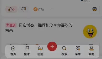
1. 效果演示
2. 7B2主题移动端底部菜单栏美化教程
修改文件:b2/Assets/fontend/mobile.css (有些可能不止一个,但是看对应代码就能辨别,差不多的就是)
(转载自许先生,原文https://mrxu.net/105.html,谢谢站长分享)
2.1 查找:.mobile-footer-menu.footer-fixed{,将该处替换为
 /*修改-www.xcbtmw.com*/
.mobile-footer-menu.footer-fixed{
position: fixed;
padding-bottom: calc(env(safe-area-inset-bottom) + 6px);
}
/*修改*/
2.2 查找:.mobile-footer-menu{,将该处替换为
/*修改-www.xcbtmw.com*/
.mobile-footer-menu{
box-shadow: 0 -1px 3px 0 rgba(26,26,26,.1);
padding: 5px;
z-index: 5;
flex-flow: nowrap;
display: flex;
justify-content: space-between;
}
/*修改-www.xcbtmw.com*/
2.3 查找:.mobile-footer-menu {,将该处替换为
 /*修改-www.xcbtmw.com*/
.mobile-footer-menu {
transform: translate(0);
transition: transform .5s,background-color .5s ease-out;
box-sizing: border-box;
left: 0;
right: 0;
background: rgba(255, 255, 255, 0.9);
border-radius: 12px;
margin: 0 auto;
width: 90%;
bottom: 10px;
}
/*修改-www.xcbtmw.com*/
2.4 查找:.mobile-footer-menu .mobile-footer-center button i {,将该处替换为
/*修改-www.xcbtmw.com*/
.mobile-footer-menu .mobile-footer-center button i {
font-size: 22px;
color: #fff;
display: block;
text-align: center;
width: 40px;
height: 40px;
line-height: 40px;
border-radius: 50%;
margin-top: -40px;
}
/*修改-www.xcbtmw.com*/
3.部分手机显示异常问题
在mobile.css 文件中最底部添加新的CSS样式可解决苹果显示问题
 @media screen and (max-width: 768px){
.mobile-footer-menu .mobile-footer-center button i {
right: -30%;
position: absolute;
top: 50%;
}
.mobile-footer-center {
padding: 10px;
}
}
4.移动端底部菜单栏常驻
目前7B2主题移动端菜单栏往下滑动时会自动隐藏,将以mobile.css中下代码删除,或者注释掉即可常驻,不会自动隐藏了
/*固定菜单栏---https://www.xcbtmw.com/13120.html
.mobile-footer-menu.footer-down{
transform: translate(0,100%);
transition: transform .5s,background-color .5s ease-out;
}
固定菜单栏https://www.xcbtmw.com/13120.html---*/
5.相关美化推荐
这个没啥好推荐的,大家点击文末的标签阅读就行,实时更新,我基本发过什么,我自己都会用的


