
WordPress网站B2主题首页致美化样式设置教程
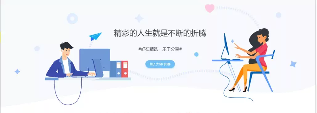
1.演示效果
2.实现教程
(1)添加首页区块
即在网站的首页添加上述区块:主题根目录index.php文件,在代码<?php do_action('b2_index_before'); ?>下面添加以下代码
<!--致美化模块开始-https://www.xcbtmw.com/16341.html-->
<div class="index-header">
<div class="ind_content-wrapper">
<div class="ind_content">
<h1 class="ind_title siuniu">精彩的人生就是不断的折腾</h1>
<div class="ind_suBTitle jxda">#好在精选,乐于分享#</div><a class="common-button button" href="/qun/" target="_blank">加入大佬QQ群</a>
</div>
<div class="ind_quan0 ind_quan"></div>
<div class="ind_quan1 ind_quan"></div>
<div class="ind_quan2 ind_quan"></div>
<div class="ind_quan3 ind_quan"></div>
<div class="ind_quan4 ind_quan"></div>
<div class="ind_quan5 ind_quan"></div>
<div class="ind_quan6 ind_quan"></div>
<div class="ind_quan7 ind_quan"></div>
<div class="ind_quan8 ind_quan"></div>
<div class="ind_quan9 ind_quan"></div>
</div>
</div>
(2)区块样式美化
在主题的style.css(或子主题)底部添加以下代码,注意svg文件需要下载,并放置网站根目录,地址和名字不能弄错
<!--致美化模块-https://www.xcbtmw.com/16341.html-->
/*致美化专用*/
.index-header {
width: 100%;
height: 624px;
margin-top: -75px;
background-image: url(/vip/svg/header-bg.svg);
background-size: auto 622px;
background-position: 50% 0;
position: relative;
background-repeat: no-repeat;
overflow: hidden;
}
.ind_content-wrapper {
position: relative;
width: 1200px;
margin: auto;
}
.ind_content {
display: -ms-flexbox;
display: flex;
padding-top: 200px;
-ms-flex-direction: column;
flex-direction: column;
-ms-flex-align: center;
align-items: center;
width: 1200px;
height: 409px;
margin: 0 auto;
position: relative;
z-index: 1;
background-image: url(/vip/svg/06.png.webp);
background-size: cover;
}
.ind_title {
font-size: 40px;
color: #404040;
}
.ind_subtitle {
width: 727px;
text-align: center;
margin: 43px;
font-size: 22px;
color: #111f33;
}
.common-button {
box-shadow: 0 4px 8px 0 rgba(110, 192, 245, .5);
border-radius: 25px;
background: #6ec0f5;
border: 1px solid #67baf0;
font-size: 16px;
padding: 8px 22px;
transition: all .2s;
color: #fff;
}
.ind_quan {
position: absolute;
background-size: cover;
z-index: 0;
}
.ind_quan0 {
left: 113px;
top: 125px;
width: 60px;
height: 60px;
background-image: url(/vip/svg/toy5.svg);
-webkit-animation: toy 3s infinite;
animation: toy 3s infinite;
}
.ind_quan1 {
left: -158px;
top: 415px;
width: 32px;
height: 32px;
background-image: url(/vip/svg/toy1.svg);
-webkit-animation: toy 3s infinite;
animation: toy 3s infinite;
}
.ind_quan2 {
left: -55px;
top: 296px;
width: 29px;
height: 29px;
-webkit-animation: upAnimation 3s infinite;
animation: upAnimation 3s infinite;
background-image: url(/vip/svg/toy2.svg);
}
.ind_quan3 {
left: 465px;
top: 129px;
width: 49px;
width: 49px;
height: 49px;
-webkit-animation: zhuan 3s .2s infinite;
animation: zhuan 3s .2s infinite;
background-image: url(/vip/svg/toy3.svg);
}
.ind_quan4 {
right: 400px;
top: 330px;
width: 24px;
height: 24px;
-webkit-animation: toy 3s 1s infinite;
animation: toy 3s 1s infinite;
background-image: url(/vip/svg/toy4.svg);
}
.ind_quan5 {
left: 830px;
top: 74px;
width: 54px;
height: 54px;
-webkit-animation: toy 3s .8s infinite;
animation: toy 3s .8s infinite;
background-image: url(/vip/svg/xin.svg);
}
.ind_quan6 {
left: 961px;
top: 261px;
width: 27px;
-webkit-animation: zhuan .5s .2s infinite;
animation: zhuan .5s .2s infinite;
height: 23px;
background-image: url(/vip/svg/toy6.svg);
}
.ind_quan7 {
left: 1271px;
top: 373px;
width: 40px;
height: 40px;
-webkit-animation: zhuan 2s 1.5s infinite;
animation: zhuan 2s 1.5s infinite;
background-image: url(/vip/svg/toy7.svg);
}
.ind_quan8 {
width: 83px;
height: 84px;
left: 228px;
top: 623px;
-webkit-animation: toy2 3s .1s infinite;
animation: toy2 3s .1s infinite;
background-image: url(/vip/svg/toy2.svg);
}
.ind_quan9 {
width: 30px;
height: 30px;
right: -30px;
top: 122px;
-webkit-animation: aroundAnimation 3s .1s infinite;
animation: aroundAnimation 3s .1s infinite;
background-image: url(/vip/svg/toy2.svg);
}
/*致美化选择器*/
@-webkit-keyframes toy {
0% {
-webkit-transform: scale(1);
transform: scale(1)
}
50% {
-webkit-transform: scale(.7);
transform: scale(.7)
}
to {
-webkit-transform: scale(1);
transform: scale(1)
}
}
@keyframes toy {
0% {
-webkit-transform: scale(1);
transform: scale(1)
}
50% {
-webkit-transform: scale(.7);
transform: scale(.7)
}
to {
-webkit-transform: scale(1);
transform: scale(1)
}
}
@-webkit-keyframes toy2 {
0% {
-webkit-transform: scale(.7);
transform: scale(.7)
}
50% {
-webkit-transform: scale(1);
transform: scale(1)
}
to {
-webkit-transform: scale(.7);
transform: scale(.7)
}
}
@keyframes toy2 {
0% {
-webkit-transform: scale(.7);
transform: scale(.7)
}
50% {
-webkit-transform: scale(1);
transform: scale(1)
}
to {
-webkit-transform: scale(.7);
transform: scale(.7)
}
}
@keyframes zhuan {
0% {
-webkit-transform: rotate(0deg);
}
25% {
-webkit-transform: rotate(90deg);
}
50% {
-webkit-transform: rotate(180deg);
}
75% {
-webkit-transform: rotate(270deg);
}
100% {
-webkit-transform: rotate(360deg);
}
}
@keyframes upAnimation {
0%,
100%,
20%,
50%,
80% {
transition-timing-function: cubic-bezier(0.215,.61,.355,1);
transform: translate3d(0,0,0);
}
40%,
43% {
transition-timing-function: cubic-bezier(0.755,0.50,0.855,0.060);
transform: translate3d(0,-30px,0);
}
70% {
transition-timing-function: cubic-bezier(0.755,0.050,0.855,0.060);
transform: translate3d(0,-15px,0);
}
90% {
transform: translate3d(0,-4px,0);
}
}
@keyframes aroundAnimation {
0%,
100%,
20%,
50%,
80% {
transition-timing-function: cubic-bezier(0.215,.61,.355,1);
transform: translate3d(0,0,0);
}
40%,
43% {
transition-timing-function: cubic-bezier(0.755,0.50,0.855,0.060);
transform: translate3d(-20px,0,0);
}
70% {
transition-timing-function: cubic-bezier(0.755,0.050,0.855,0.060);
transform: translate3d(-10px,0px,0);
}
90% {
transform: translate3d(20px,0,0);
}
}
(3)区块svg文件下载
下载下方文件,上传至网站根目录,尽量不要改名字,相关文章请点击文末标签阅读!


